TRBL
Türkiye Robots Battle League
Türkiye's first robot combat league, where teams from schools, universities and companies bring robots they designed and built themselves into the arena. I led the project end to end as creative director — from planning the events and running the arena to the brand, the live broadcast and the lanyard on a referee's neck.
- Role
- Creative Direction
- Client
- TRBL · MakerBee
- Year
- 2026
- Scope
- Event, brand, broadcast, content
Welcome to the arena
The league's launch film — the arena, the teams and the robots the identity was built around.
The league
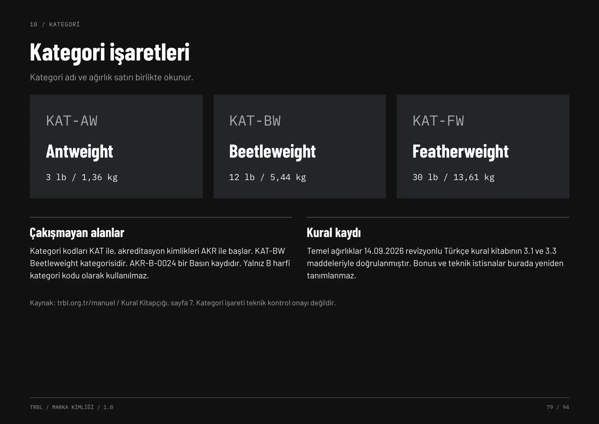
TRBL brings robot combat to Türkiye as an organised league. Teams of three or more compete in three weight classes — Antweight (3 lb), Beetleweight (12 lb) and Featherweight (30 lb) — with no age limit, from first-time student builders to company engineering teams.
The audience is split three ways: competitors need application and technical info, spectators need the matches and the experience, sponsors need scope and rights. The identity had to serve all three without cramming them onto the same poster.
What I did
Not just a logo or a guideline — I was responsible for how the league is planned, seen and experienced, on site and on screen.
Event planning
Planning and running the league's events end to end — the arena, the match day flow, accreditation and the visitor experience.
Brand identity
The full visual system and a 94-page brand guideline: logo rules, colour, type, materials, icons and photography.
Live broadcast
Broadcast graphics, on-screen safe areas, score and timer systems and the live stream manual.
Content & social
Campaign, match-day and team content across Instagram, YouTube and the website.
On-site & print
Accreditation, tickets, wayfinding, arena wraps, trophies, apparel and stationery.
Teams & partners
Communication for competitors, spectators and sponsors — each with its own information order.
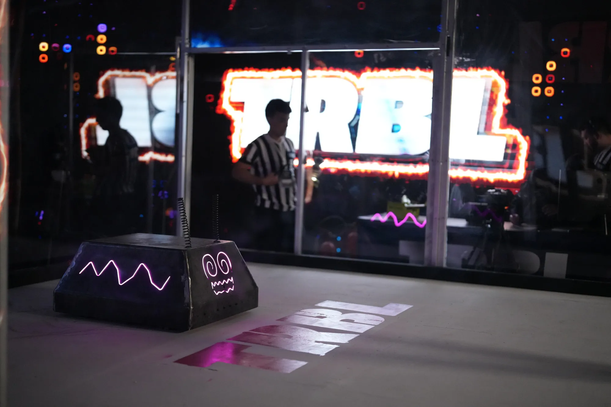
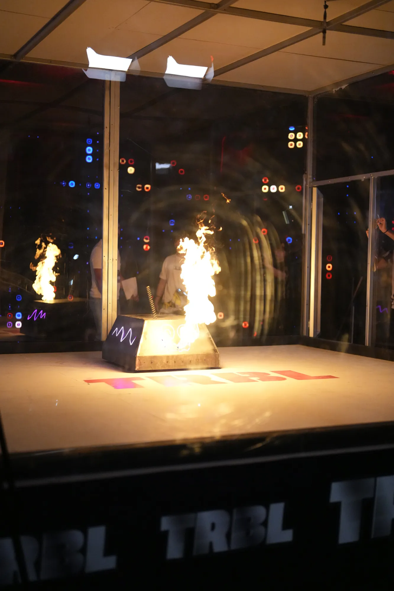
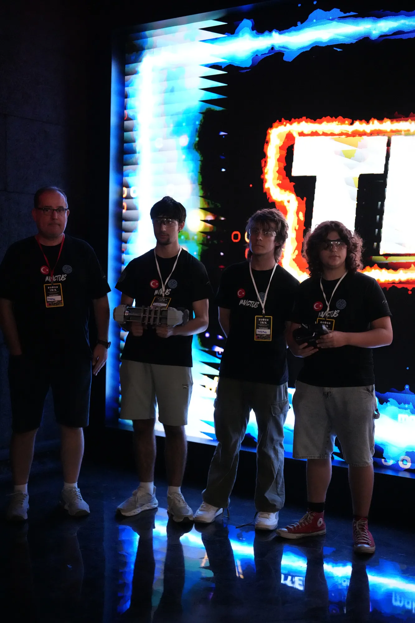
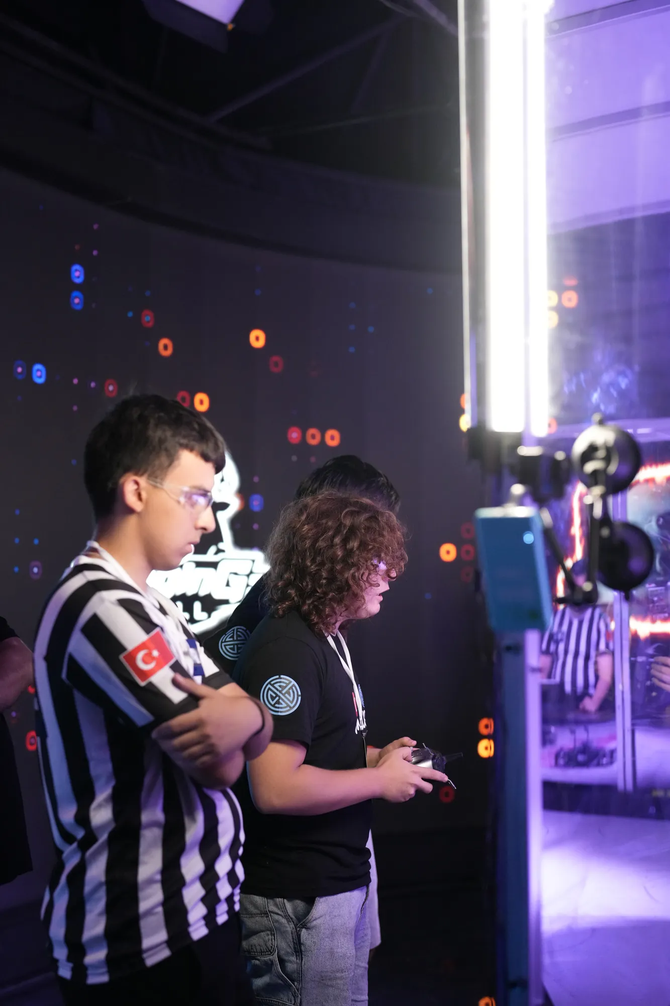
Match day
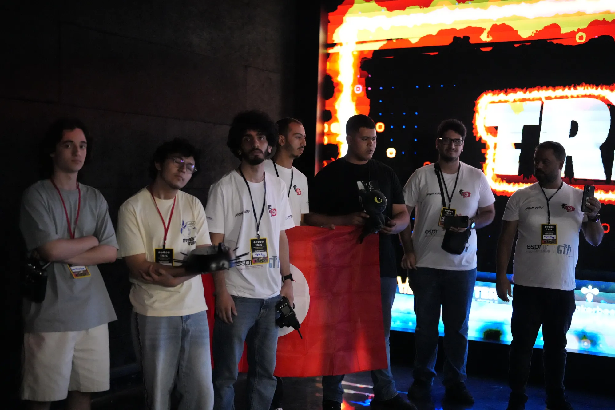
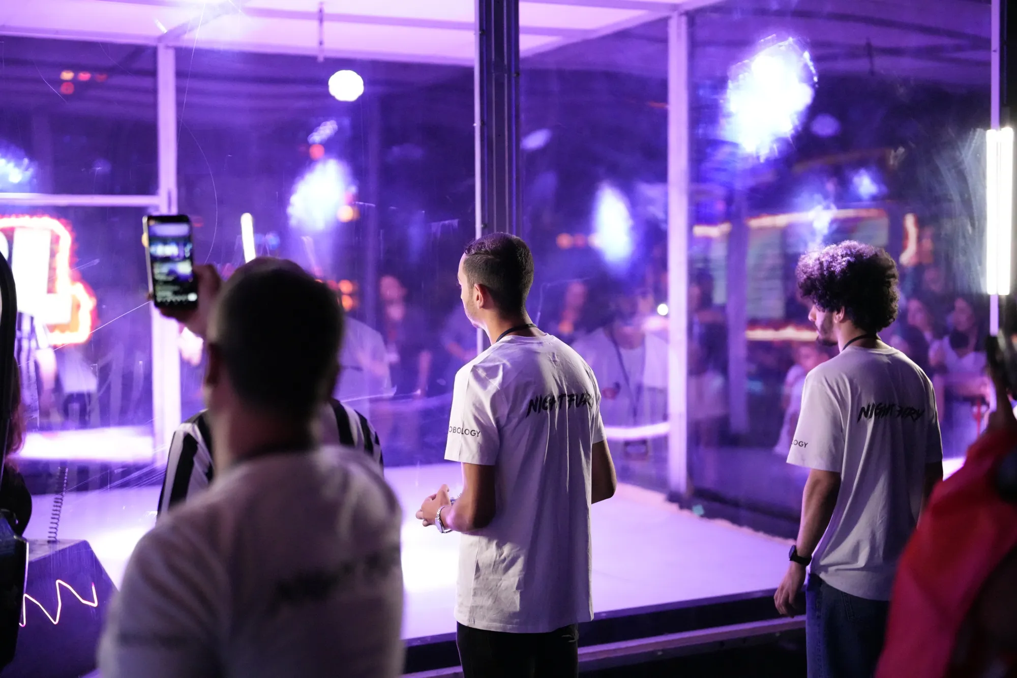
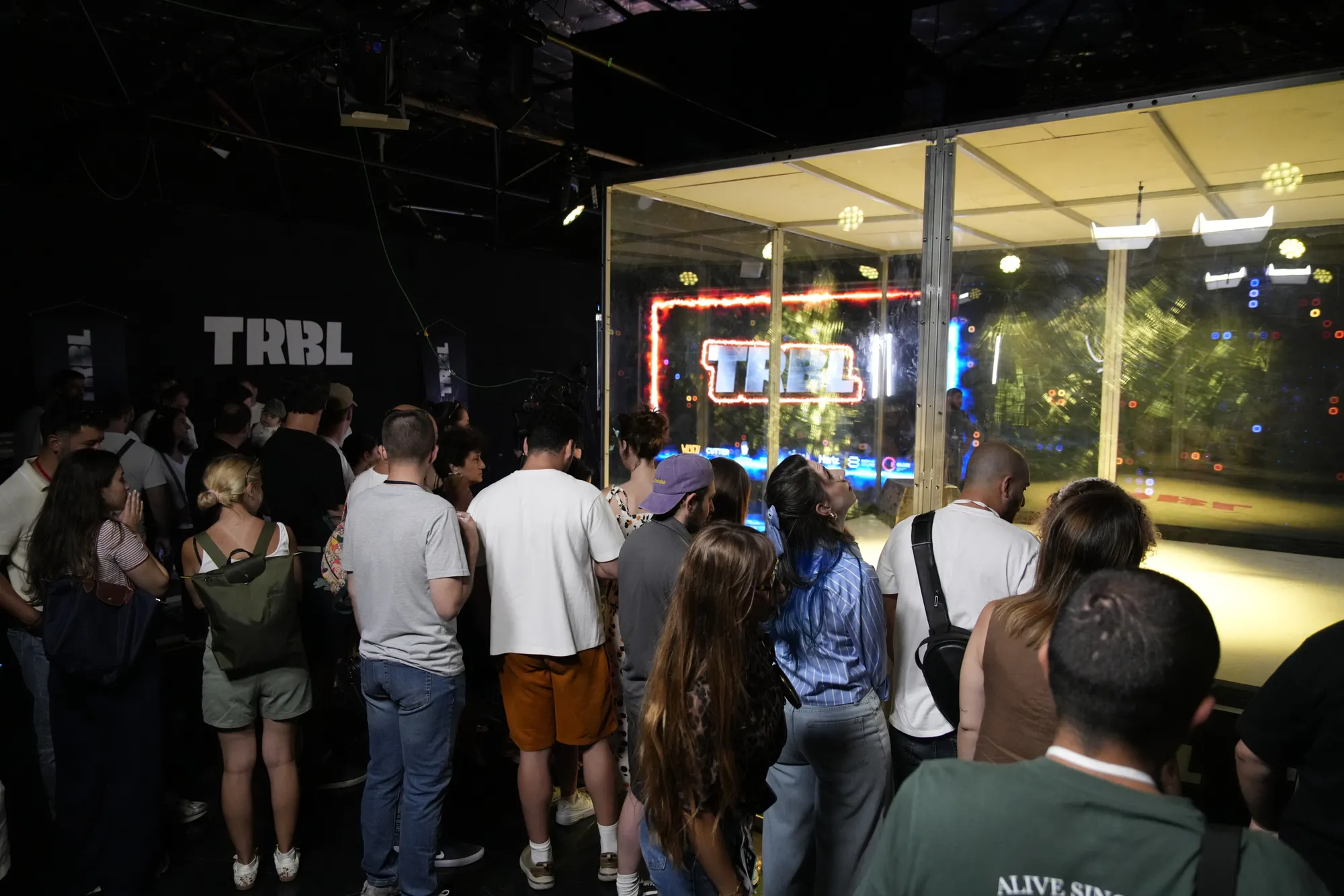
The arena, the teams, the referees and the crowd — the event as it was planned and run.
Approach
The league is about real robots, real teams and real results — so everything around it should look built, not decorated. The same rules guide the event, the screen and the poster, and they are documented in a 94-page brand guideline written as a working tool: every example shows a design decision, and every rule comes with the reason behind it. The chapters below walk through it.
Accuracy
Robot specs and results always match the official record. No invented data, no placeholder stats.
Accessibility
Information is never carried by colour or effect alone. Every text pairing is checked against WCAG contrast.
Respect for teams
Team names and logos are written exactly as registered. No artificial success stories are added.
Logo
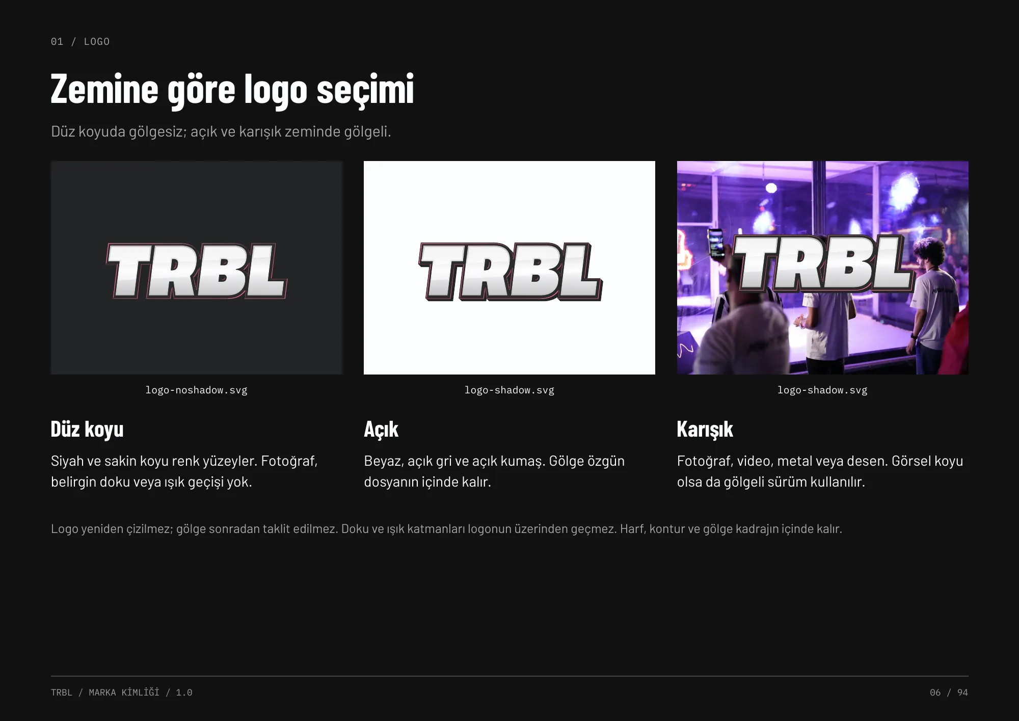
The existing metallic TRBL mark was kept and protected rather than redrawn. The guideline defines which version goes on which ground: shadowless on flat dark surfaces, shadowed on light, mixed and photographic backgrounds.
Clear space, minimum sizes (120 CSS px on screen, 30 mm in print), co-branding lock-ups and misuse rules are all specified, so the mark survives everything from a 16 px favicon to arena wraps.
Colour
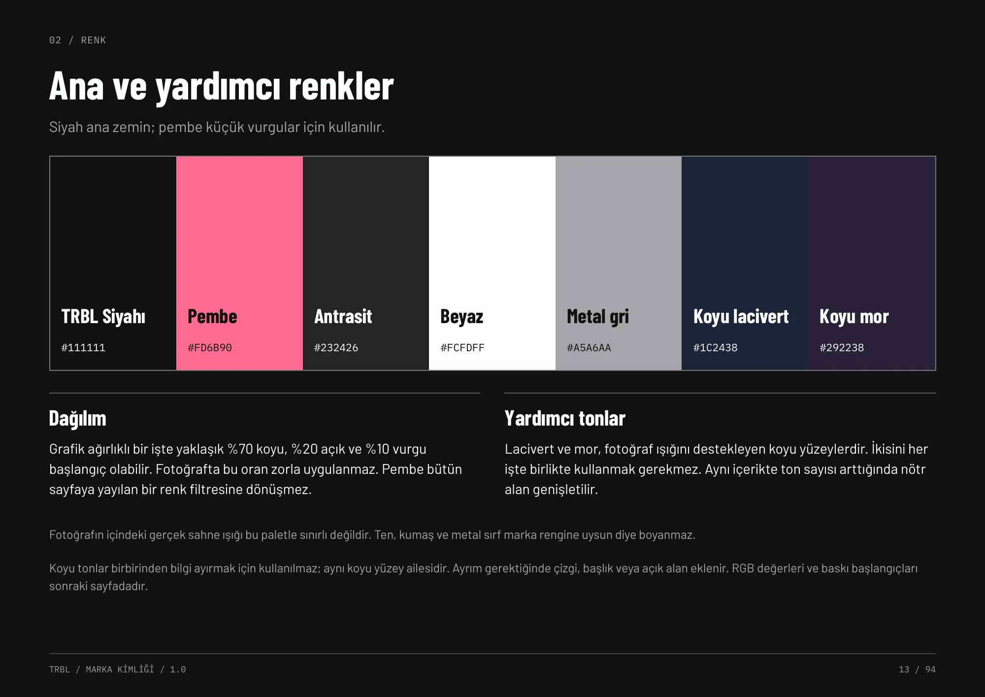
Black is the home ground; pink is a small, sharp accent — never a filter over the whole frame. Navy and purple support the stage lighting found in the arena photography.
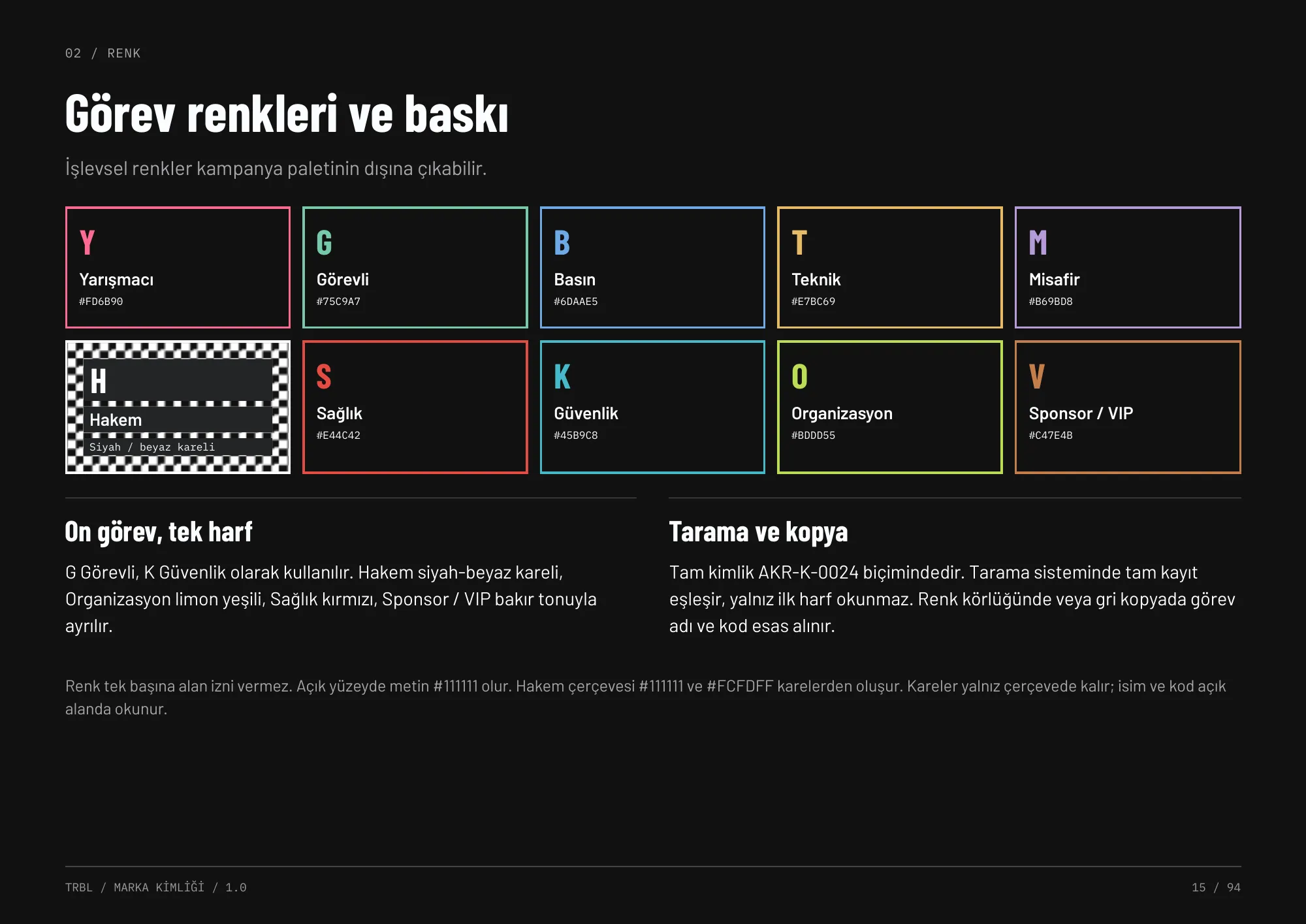
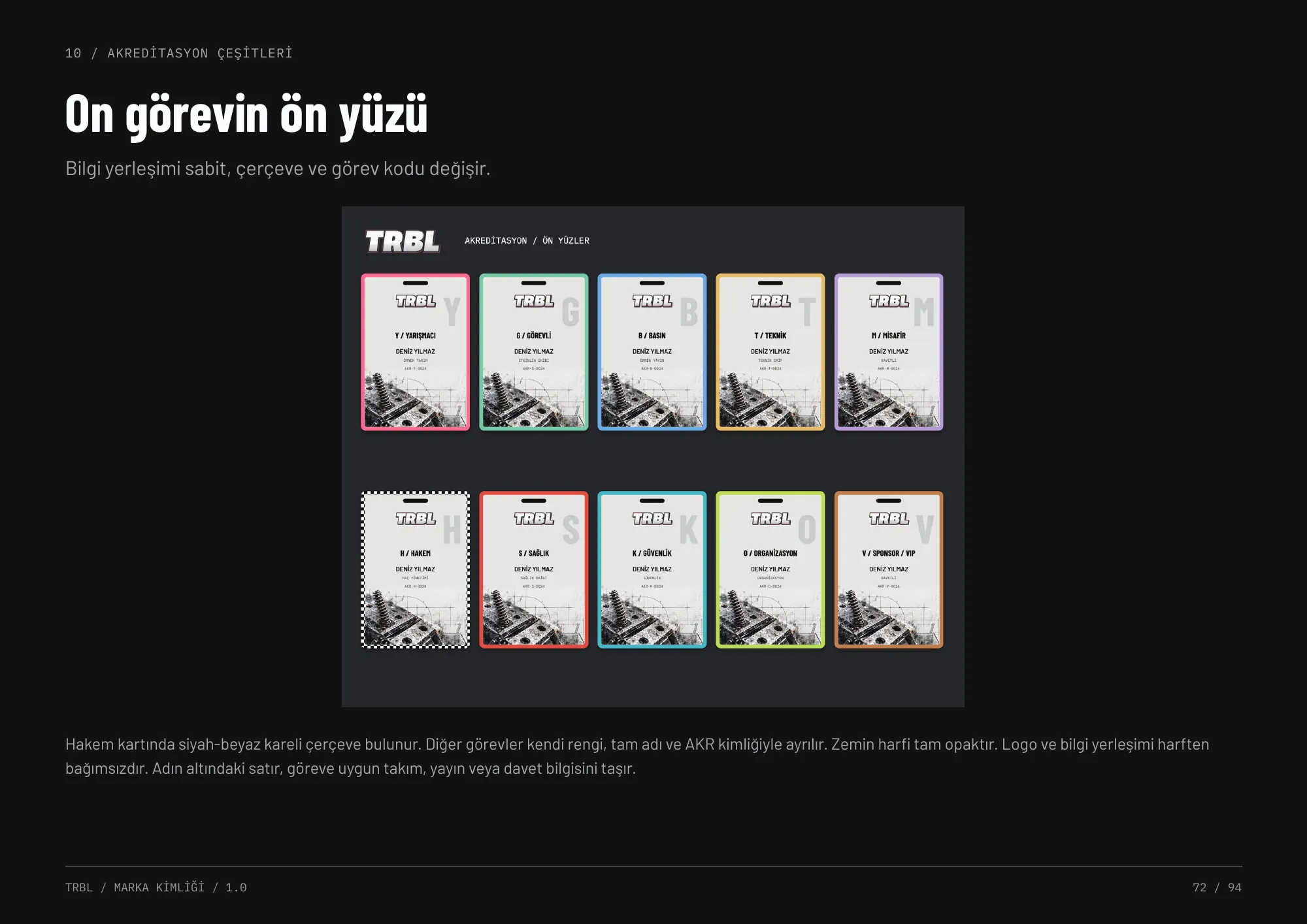
A separate functional system covers ten accreditation roles and UI states, so brand colour never has to carry operational meaning.
Typography
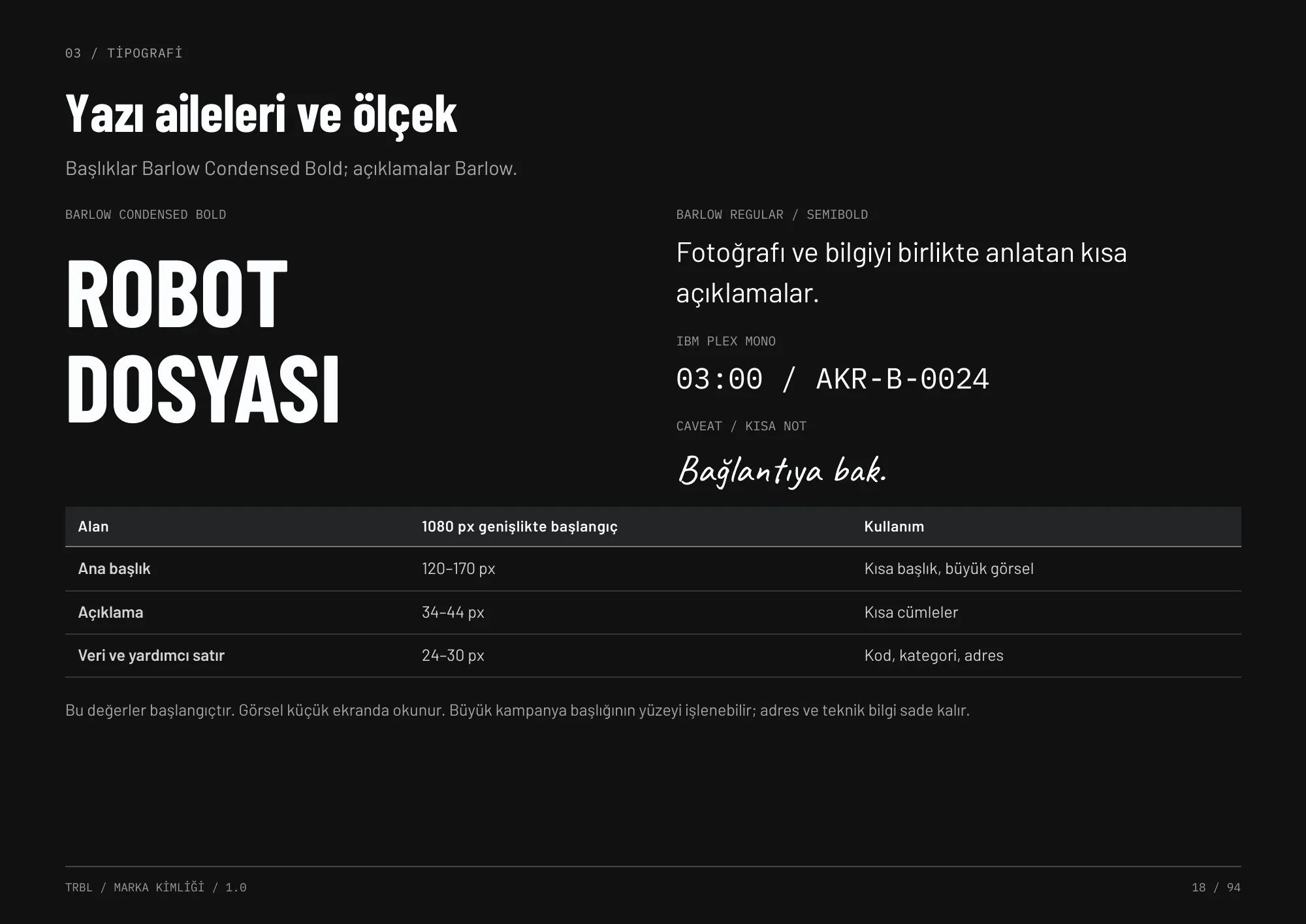
A condensed, loud headline voice paired with calm, readable body copy. Monospaced figures keep scores, timers and accreditation codes aligned, and every scale was tested with real Turkish characters — İ, Ğ, Ş, Ç, Ö, Ü.
- Barlow Condensed BoldHeadlines
- Barlow Regular / SemiboldBody & subheads
- IBM Plex MonoData, timers, codes — 03:00 / AKR-B-0024
- CaveatShort hand-written notes
Material library
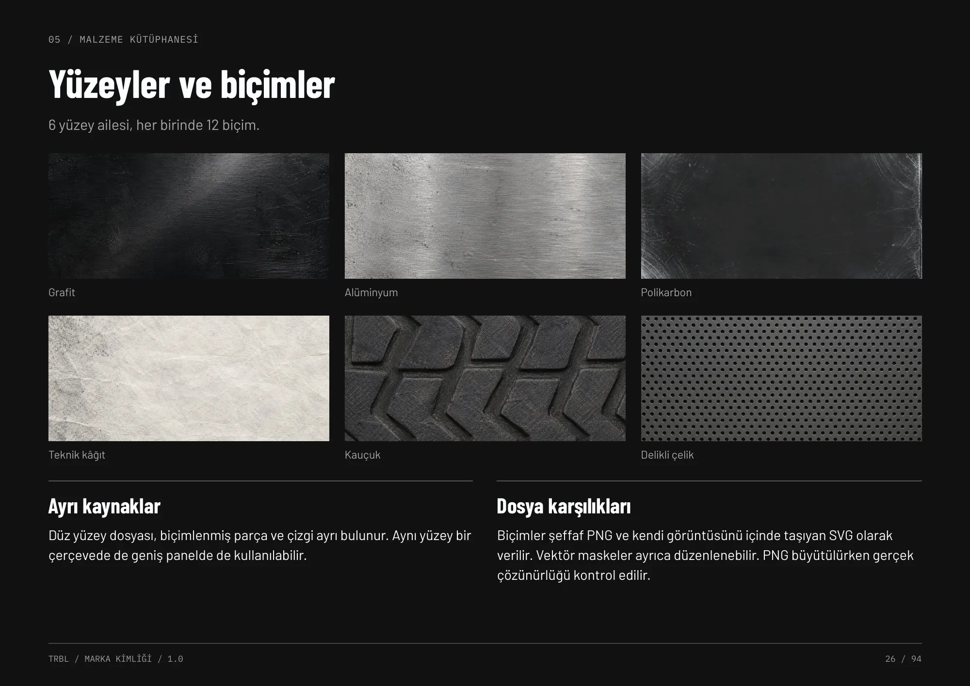
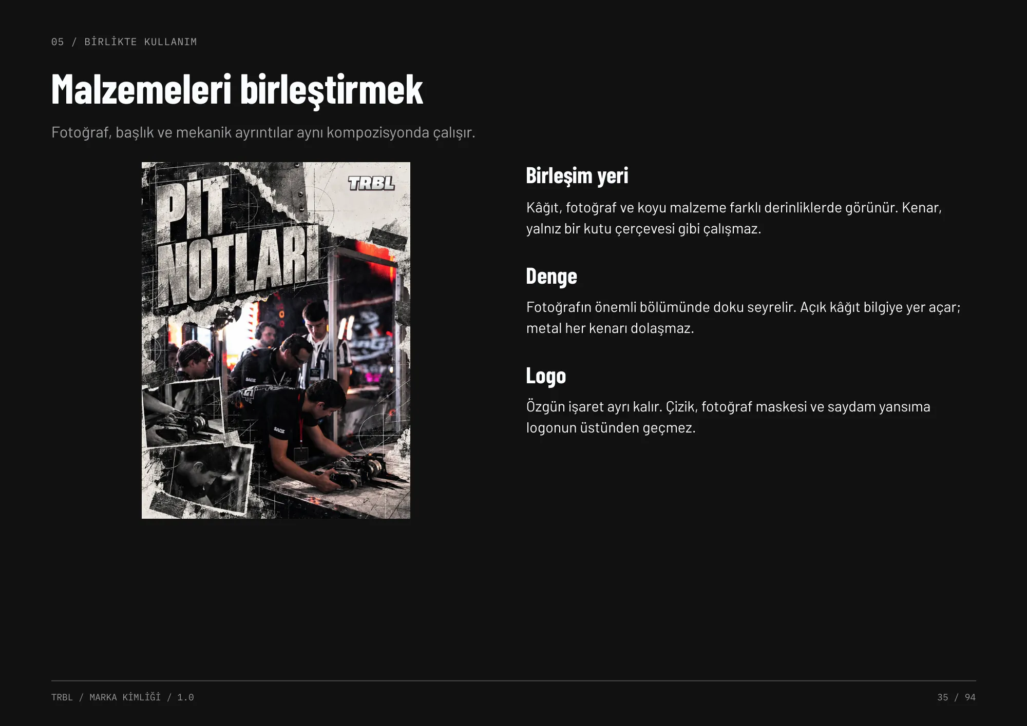
Six surface families — graphite, aluminium, polycarbonate, technical paper, rubber and perforated steel — each cut into twelve mechanical shapes. They echo the arena's real materials and let designers build layered, physical-feeling compositions without inventing new graphics each time.
Icons
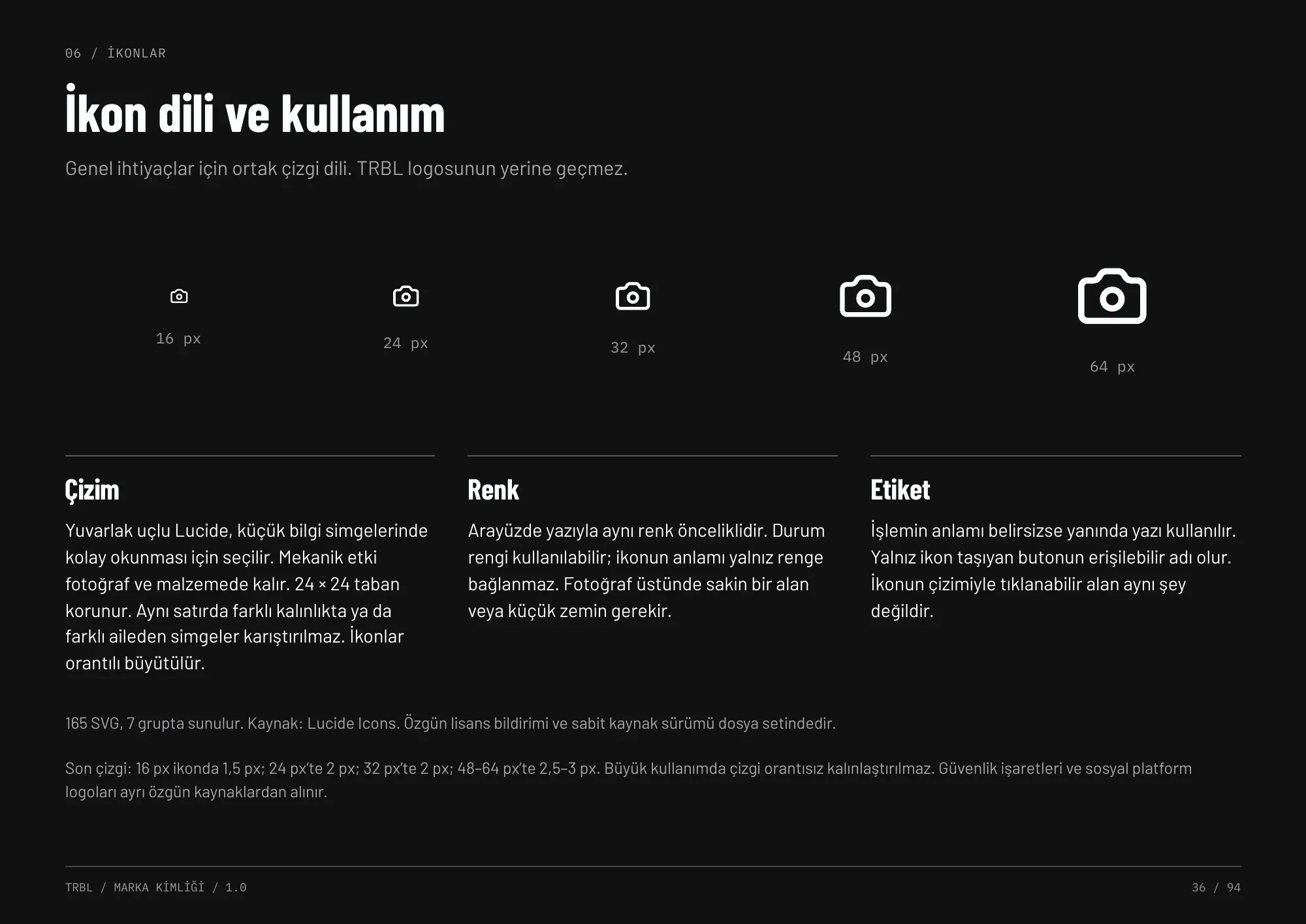
A shared line-icon language for navigation, actions, event access, media, status, technical tools and files — built for wayfinding, broadcast and the web, never as a substitute for the logo.
Photography
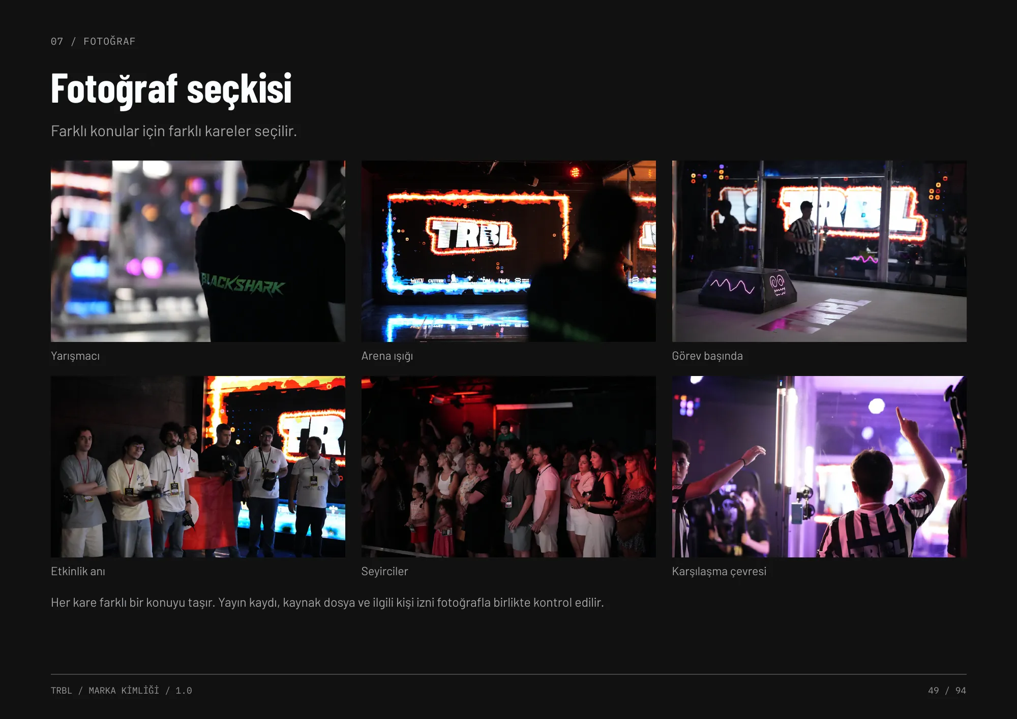
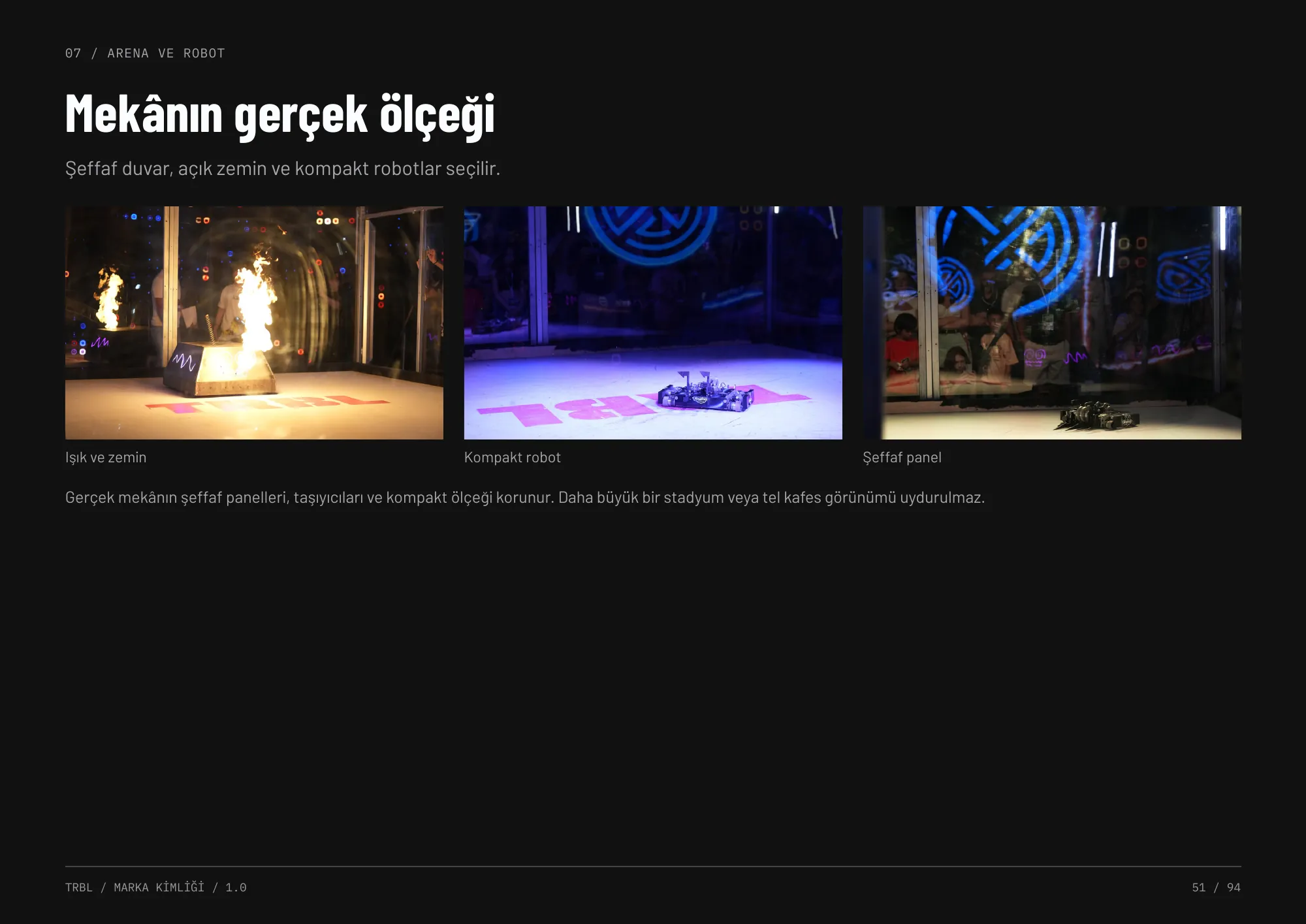
Real robots, real teams, real arena. The guideline sets rules for selection, framing and light correction, documents source discipline and image rights, and separates documentary photography from AI-generated product visuals. Photos of children follow a KVKK consent process.
Social & campaign
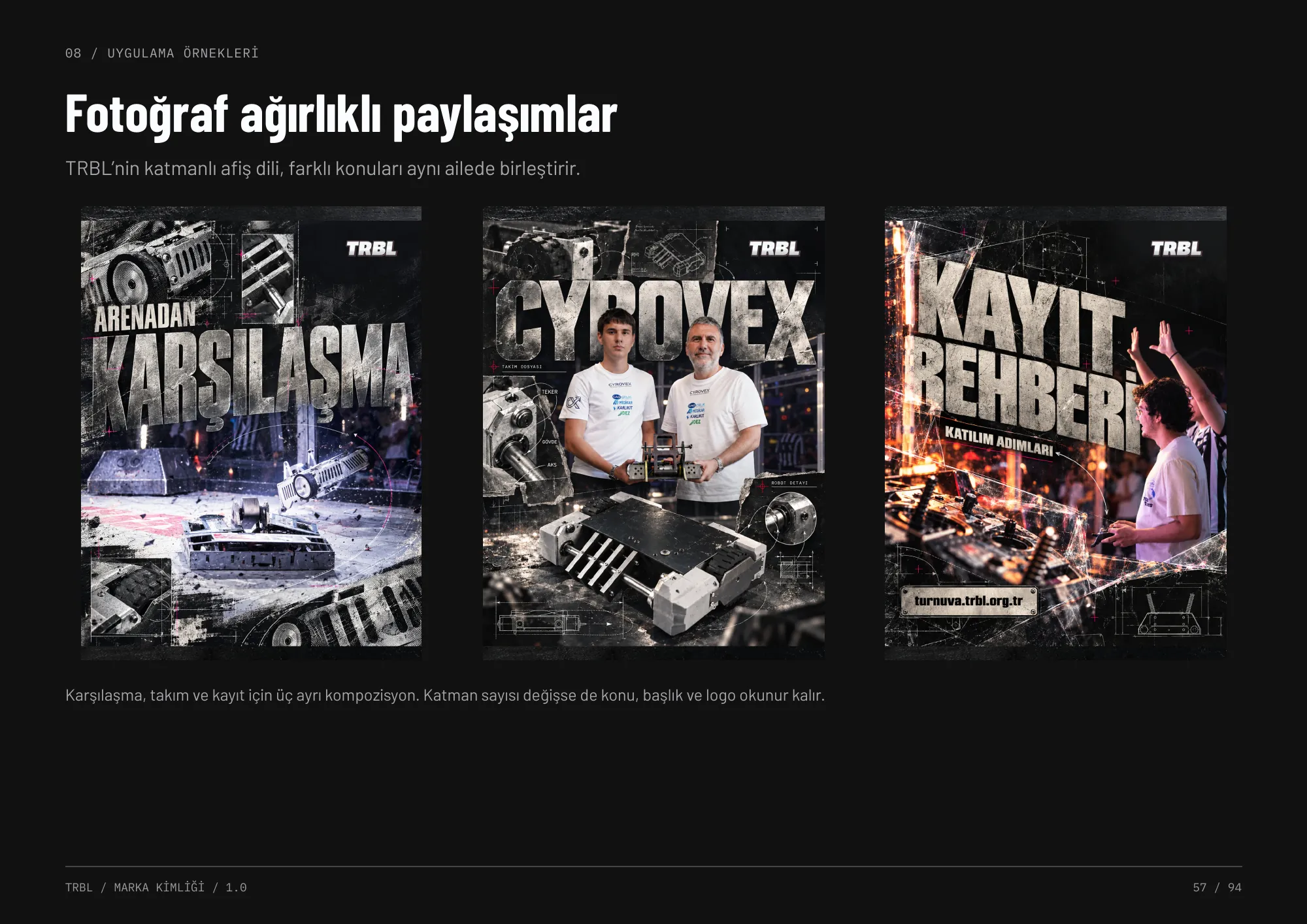
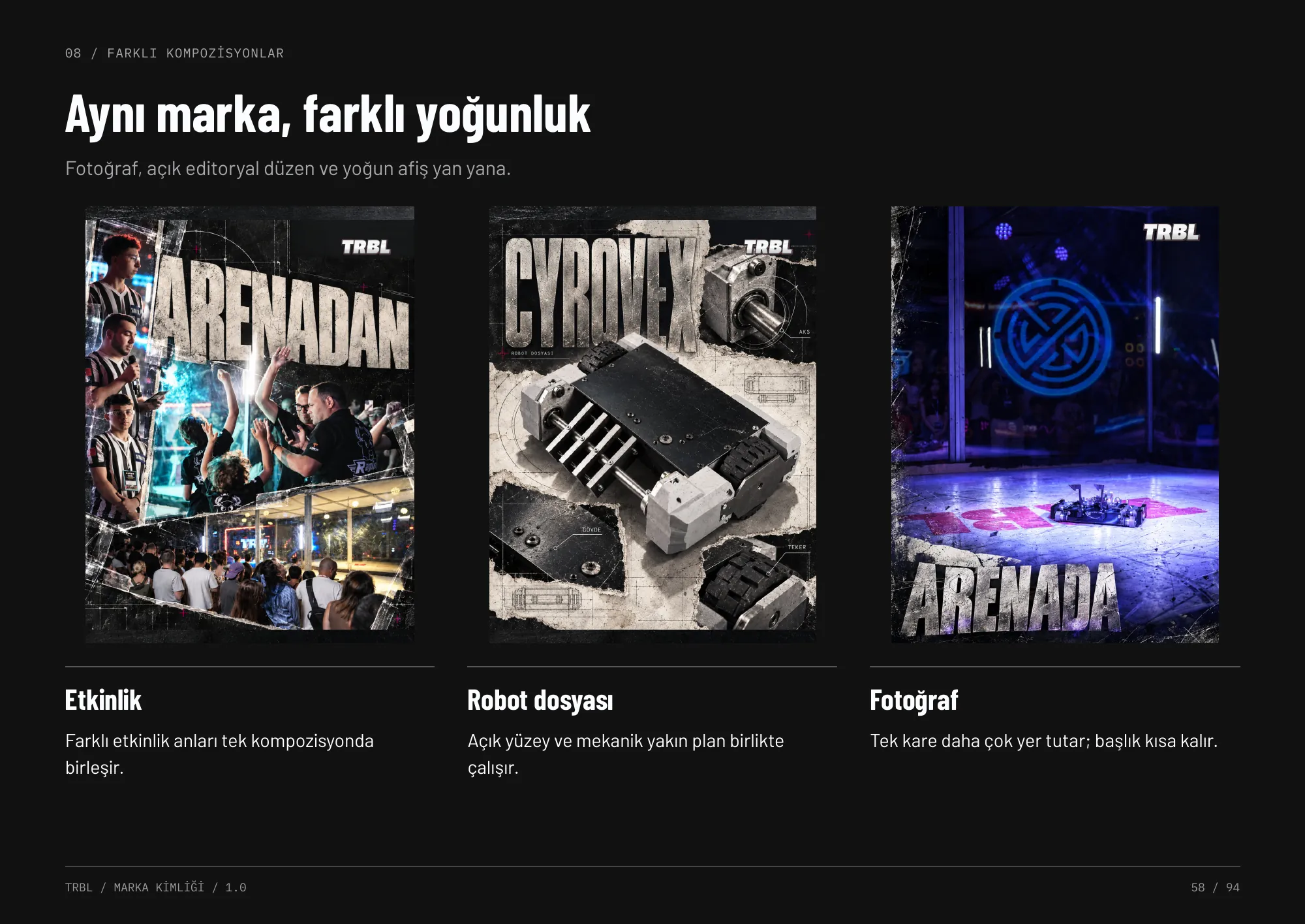
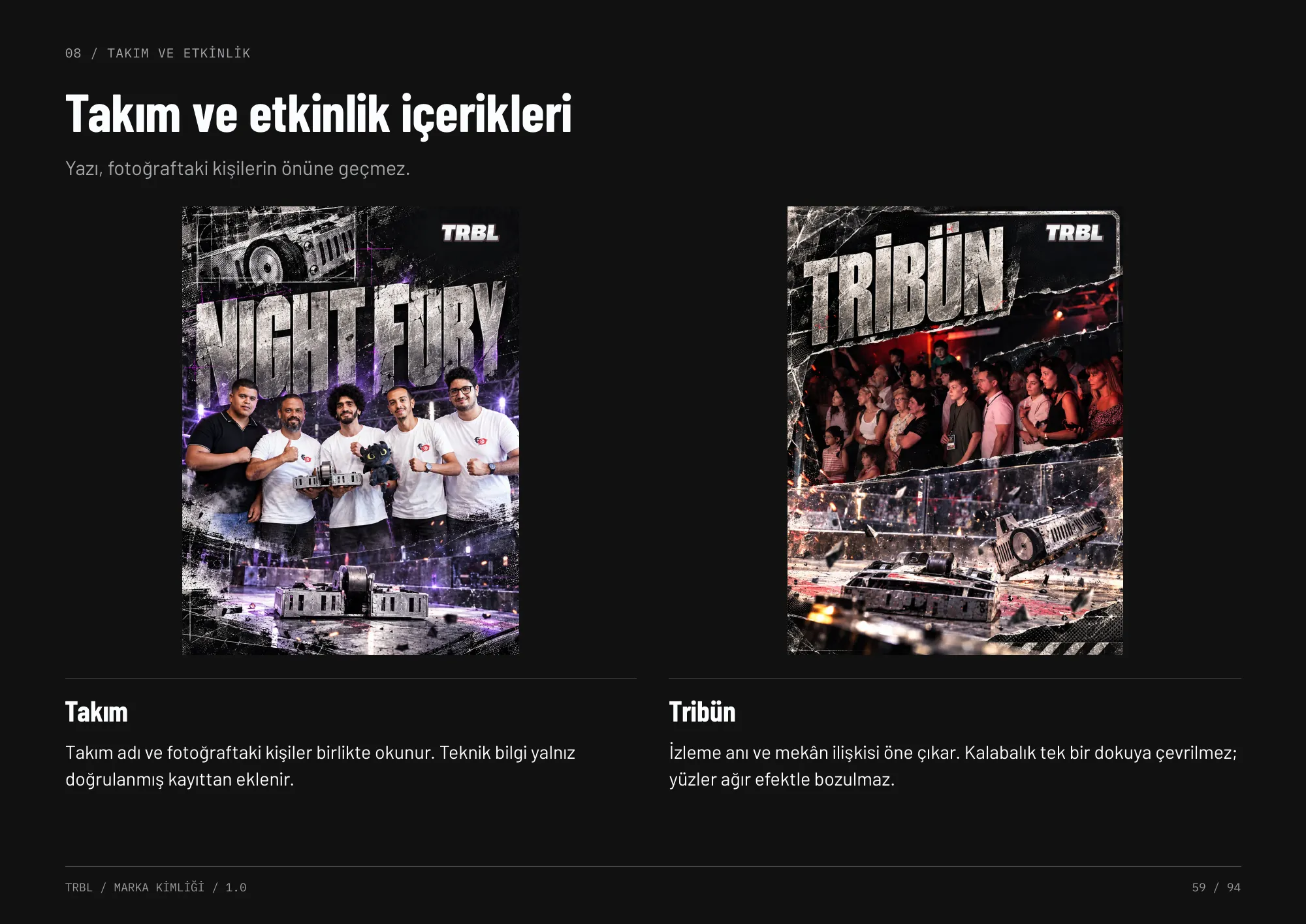
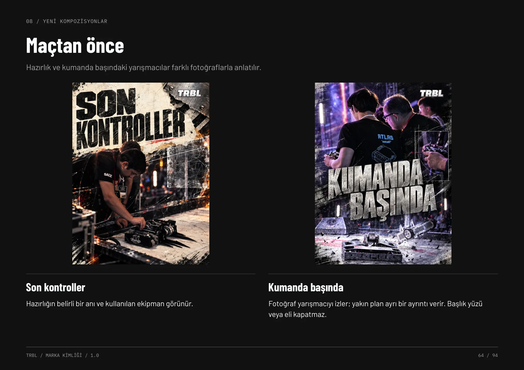
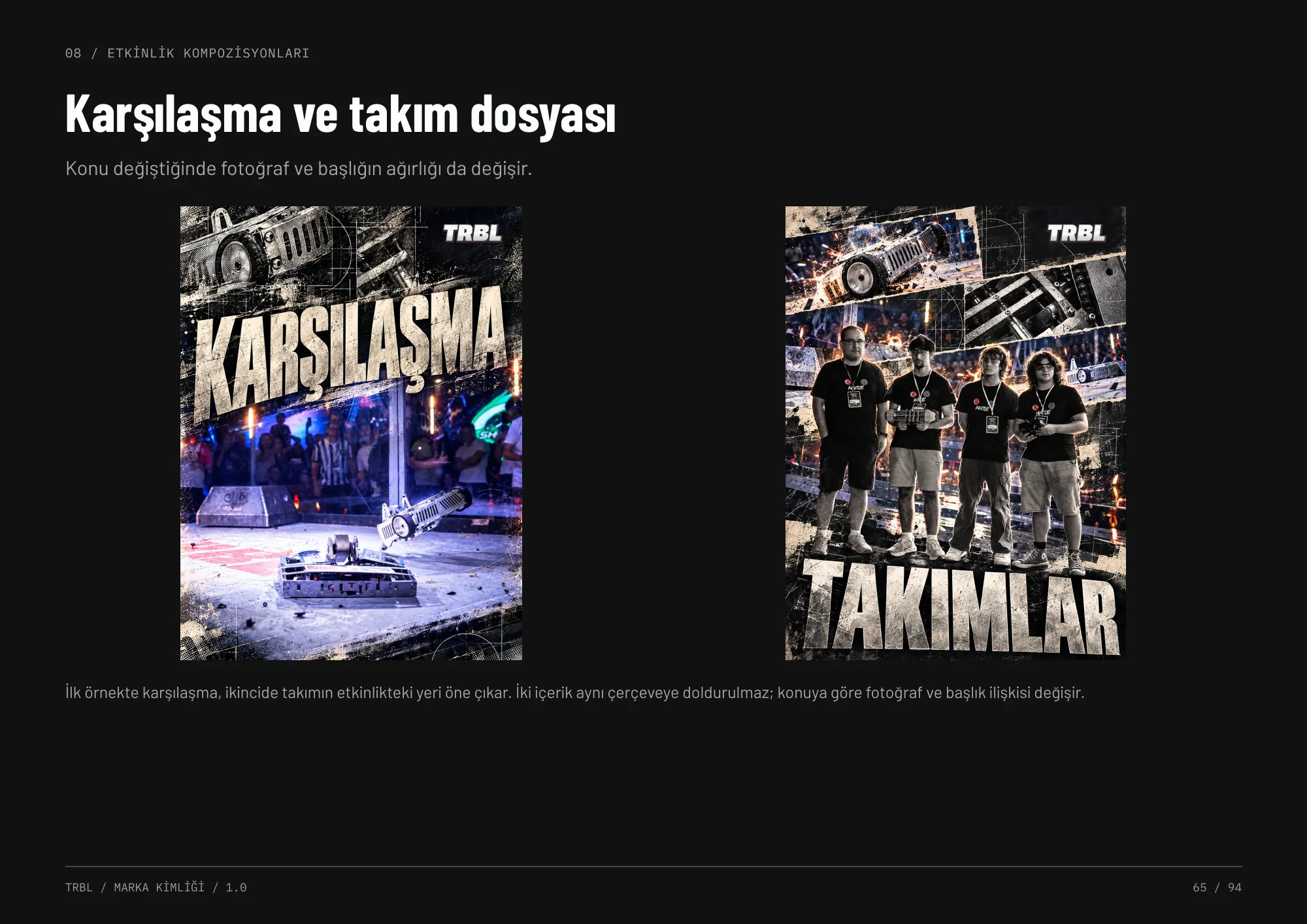
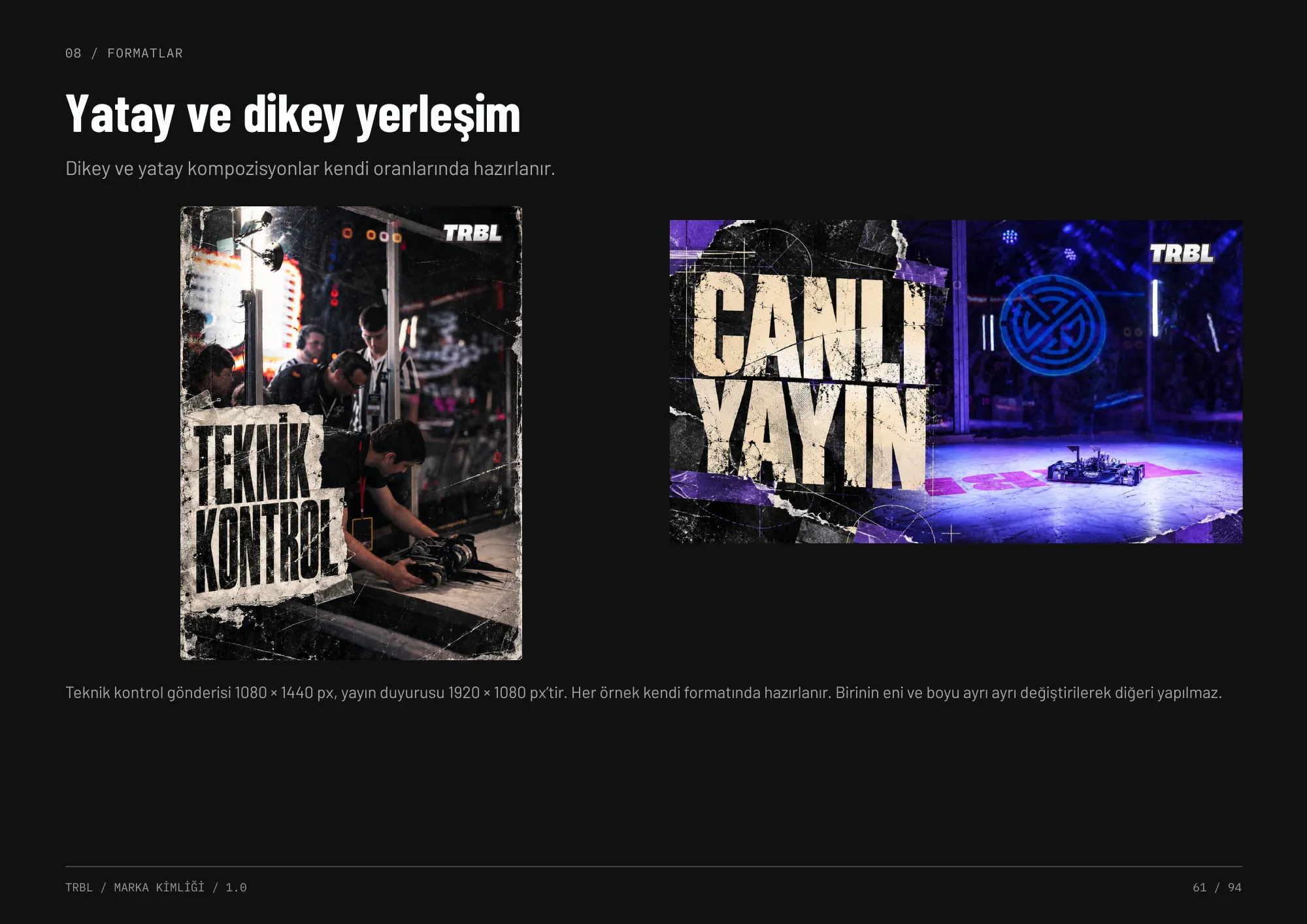
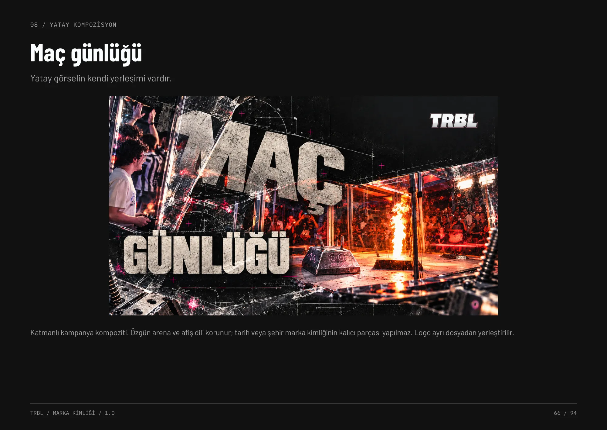
A layered, torn-poster language with heavy condensed headlines and mechanical detail. The same family stretches from photo-led posts to dense robot files and match-day diaries — the density changes with the subject, the brand stays the same.
Broadcast & digital
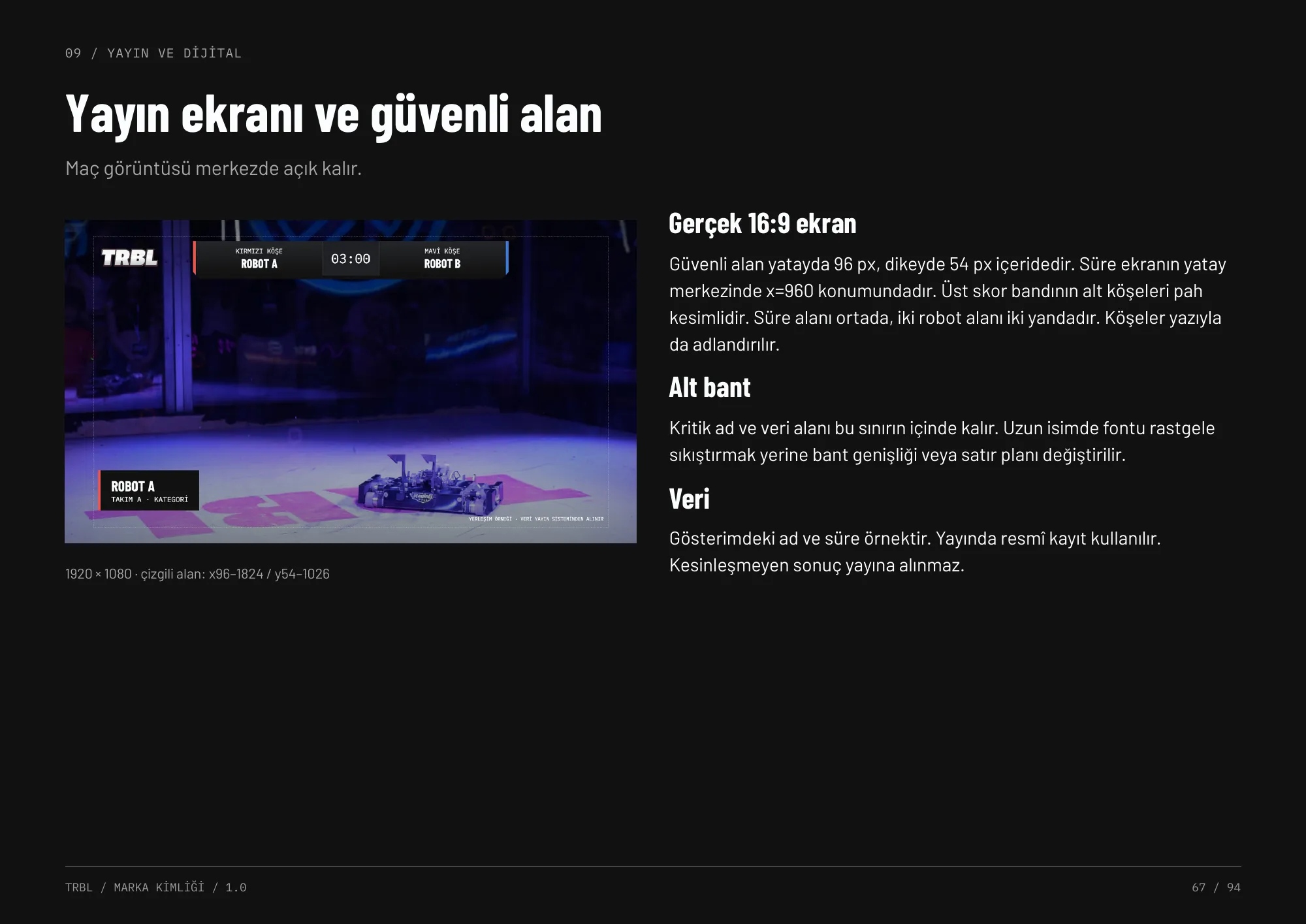
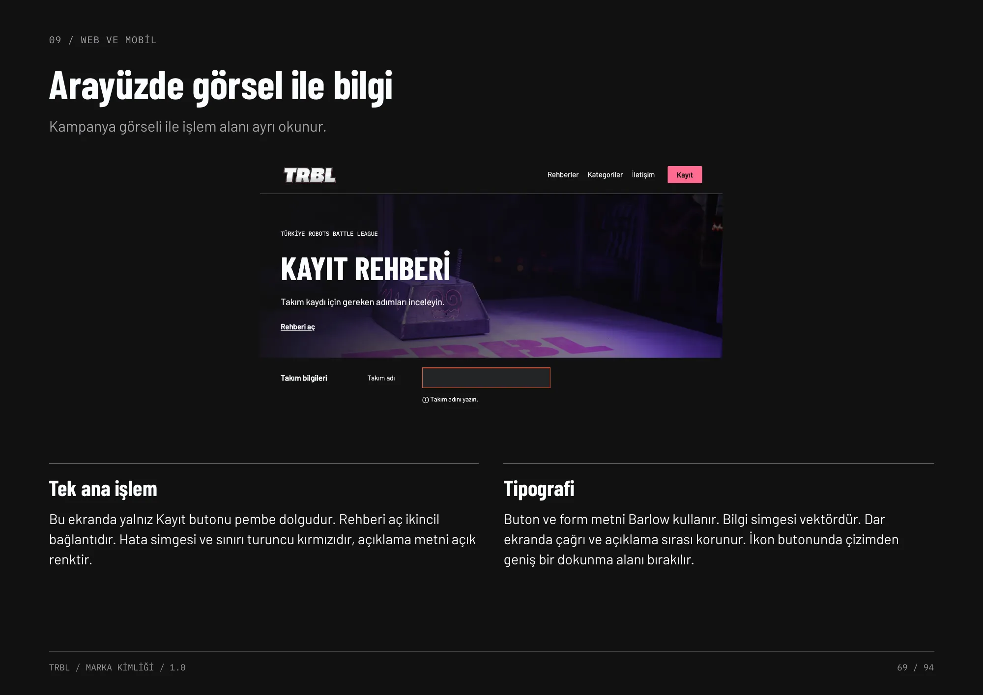
Broadcast graphics keep the match footage clear in the centre, with safe areas for scores, timers and corner colours. Web and mobile separate campaign imagery from the action area so registration stays easy to find.
Event
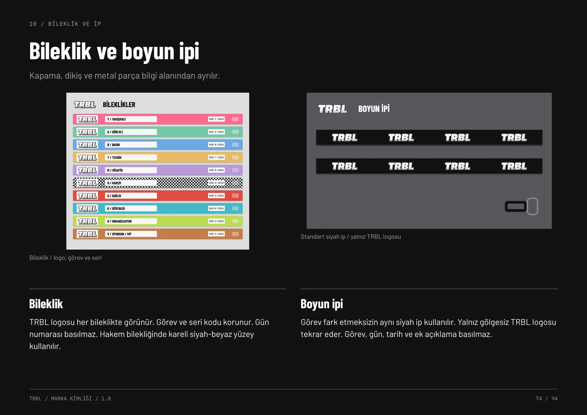
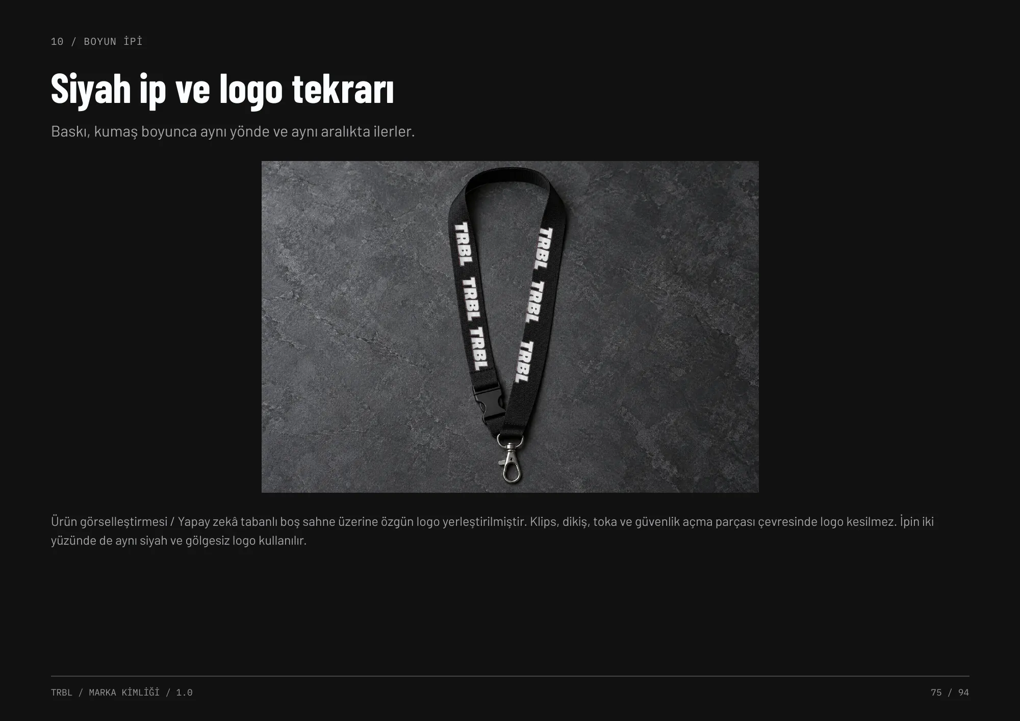
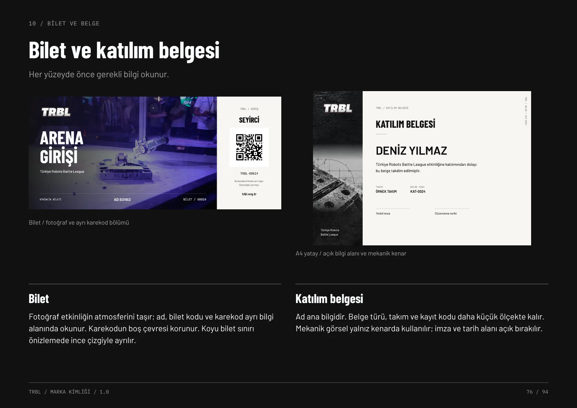
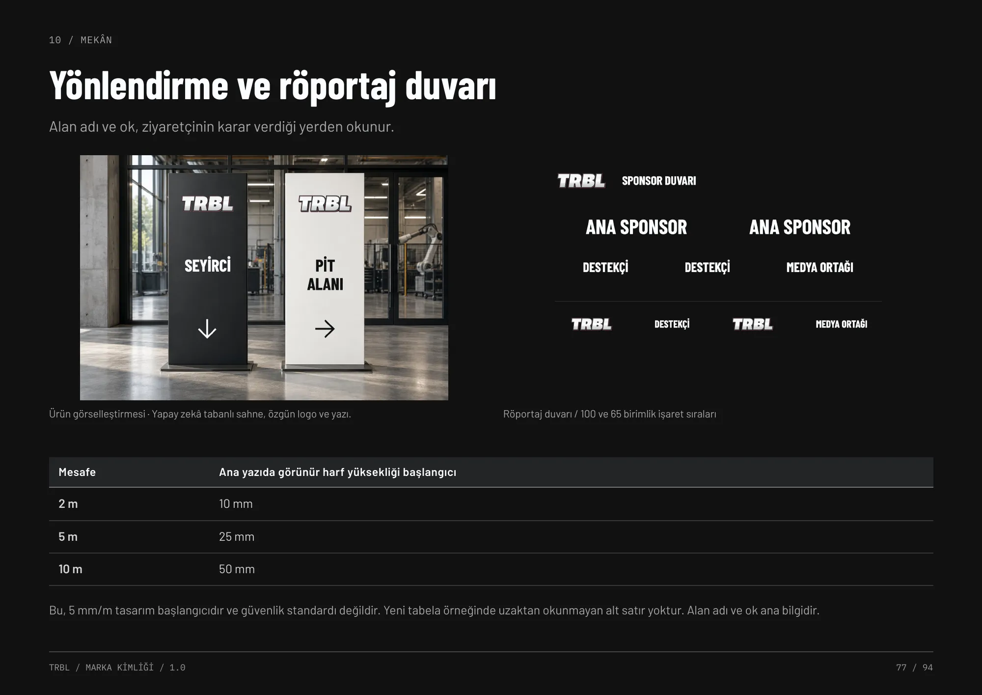
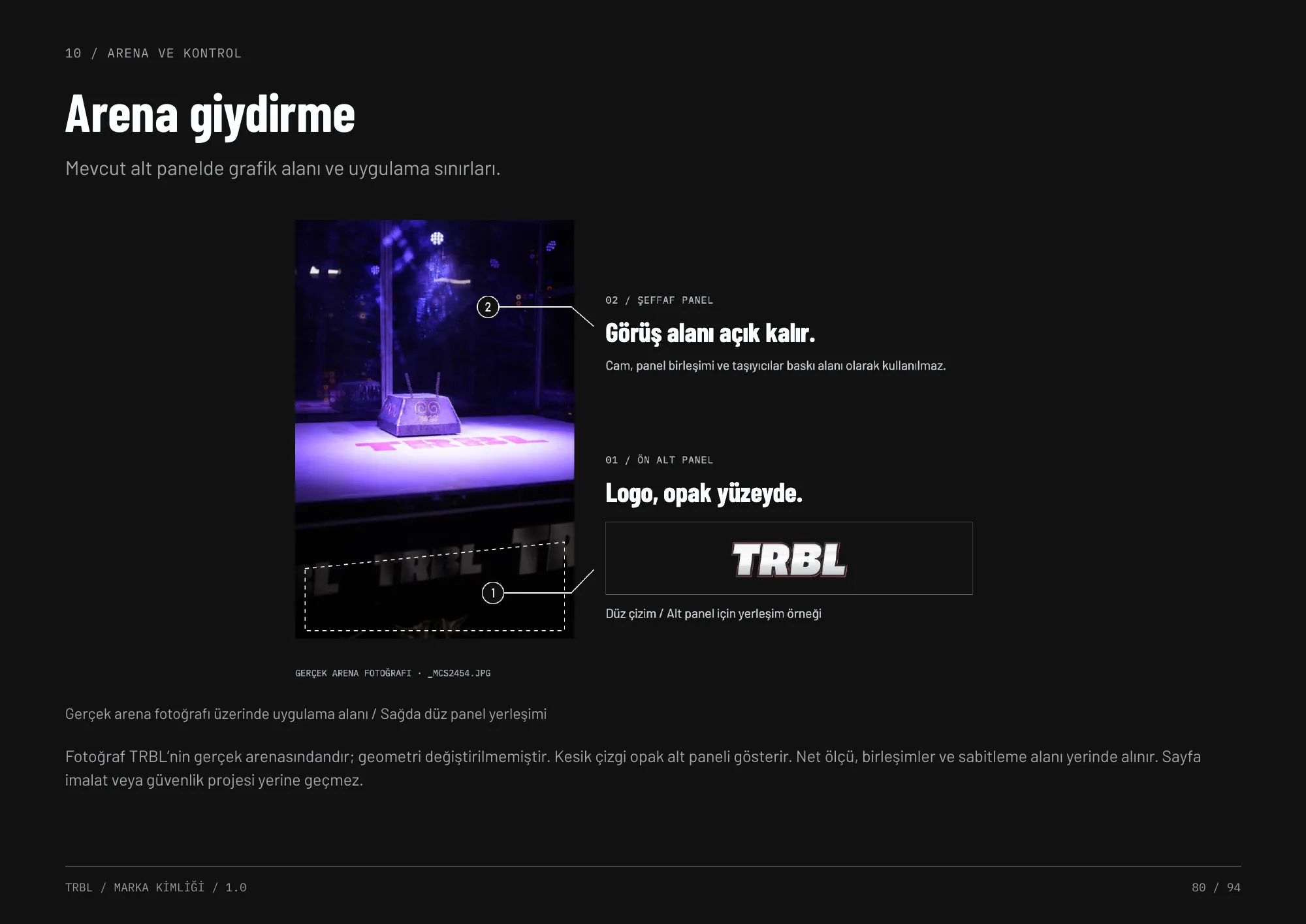
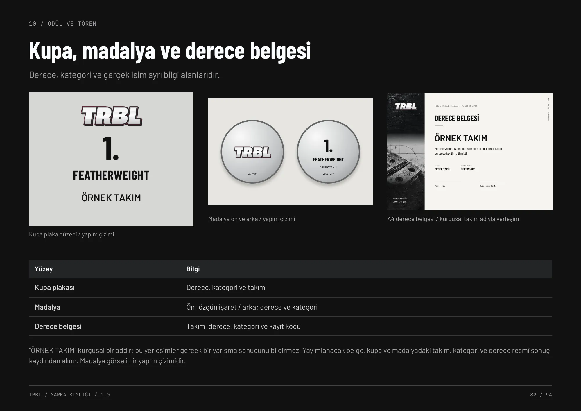
Everything the visitor, competitor and crew touch on the day: ten accreditation roles with fixed information hierarchy, wristbands and lanyards, tickets and certificates, wayfinding and interview walls, weight-class markers, arena wraps and the trophy set.
Merchandise & stationery
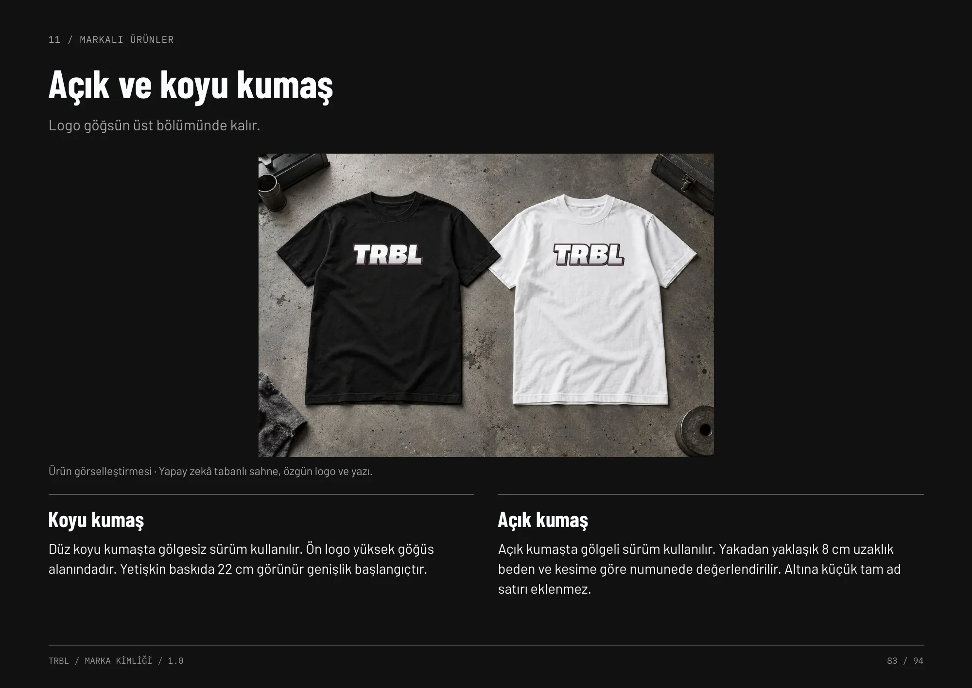
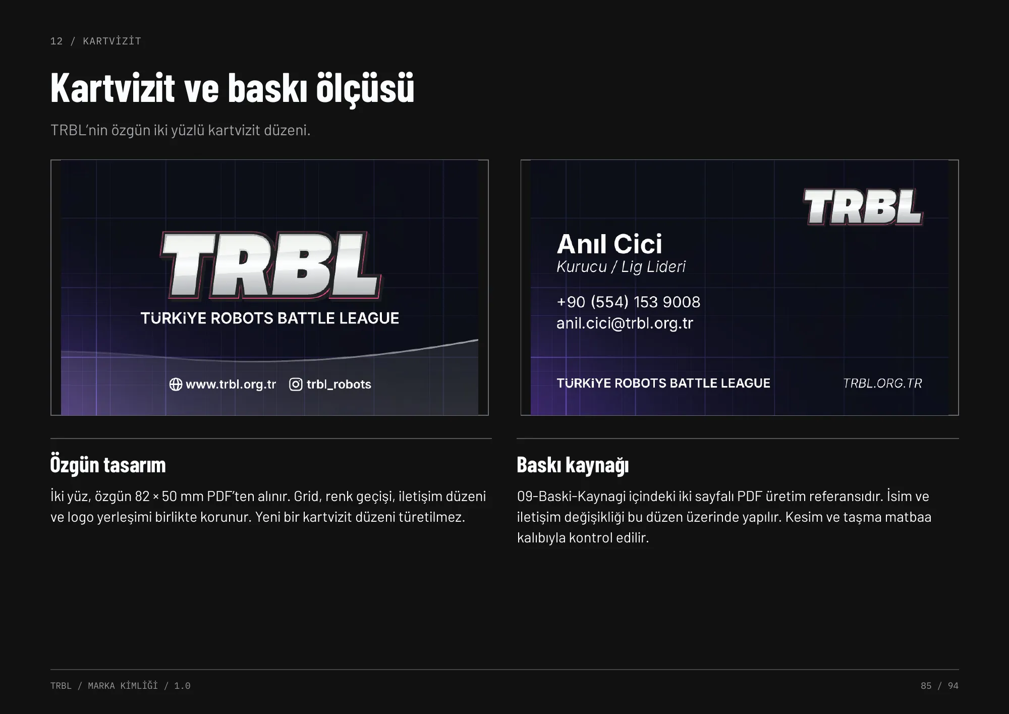
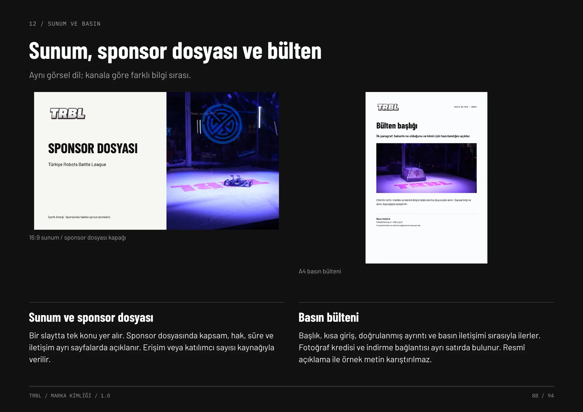
Apparel on light and dark fabric, stickers, business cards, folders, letterheads and presentation templates — the same visual language, reordered for each channel.
See it live
Next event: 23–24 January 2027, İstanbul. Follow the league for match days, robot files and results.